Shop the video
The Light Spring fall capsuletwelve pieces, not one dark color
There is not a single dark color in a Light Spring palette. The closest thing to one is camel, and it shows up exactly twice — on the coat and the boots, the two heaviest pieces you own. Everything else stays light enough to layer, which is exactly the problem a Light Spring capsule usually runs into every September: if nothing dark is doing the grounding, what is? Not depth. Temperature. One cool color — pale aqua — sits inside an otherwise warm palette and does the job a dark boot does for everyone else: it gives the eye somewhere to land. Five of your colors have a job written next to them on your season page, and those five are the first five pieces below. The other seven repeat them, and only one piece in the whole capsule is allowed to be both dark and heavy at once.
The pieces below are Amazon links, and Your Style Hue earns a commission if you buy through one — at no extra cost to you. Nothing here is paid placement. Each piece was chosen because its color actually matches the shade it sits under. Most come in a dozen colors, so check the one on Amazon matches before you buy.
The twelve pieces · tap one to jump to it


Wear it
Three outfits from the twelve.
Put together from the pieces on this page, so every one works with the rest. Tap a piece to see it on Amazon.
Peach at your face
Your face color over your anchor, with camel boots as the one darker note.
The cool one
Pale aqua does the cool job; buttercream jeans and a sand bag keep it warm and light.
Soft layers
Coral cardigan over a buttercream tee, the sand skirt, and the aqua scarf if you want it. Nothing dark anywhere.


01 · Your anchor neutral
Warm Sand
On most palettes an anchor neutral does its job by being the darkest, steadiest thing in the outfit.
Why this worksLess
Yours cannot — there is nothing dark to spend here — so warm sand holds things together by repetition instead. It appears three times across this capsule, and this wide-leg pant is the first and biggest use of it. Treat it as the piece the rest of the capsule gets built around, not the piece you add last.

02 · Your white
Buttercream
Optic white photographs colder than your skin can match, which is what your white is quietly correcting for.
Why this worksLess
Buttercream does the same job as a plain layer under everything else, without the chill. A tee is the least dramatic piece on this page and probably the one you will wear most, since it sits under the cardigan, the coat, or on its own with the sand pant.

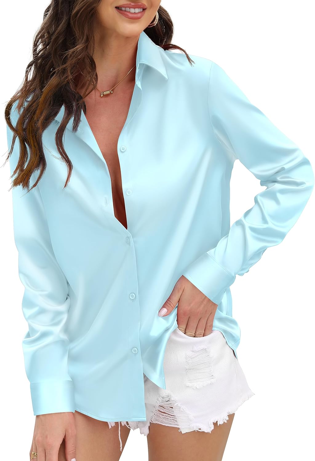
03 · Your cool note
Pale Aqua
This is the piece the whole capsule leans on.
Why this worksLess
Every other core color here runs warm, and pale aqua is the one that does not, which means it does for your outfit what a dark boot does for everyone else — it gives the eye somewhere to land instead of one long warm blur. A satin catches enough light to keep the color visible rather than letting it disappear into a matte finish, which matters more on the one cool piece than on any of the warm ones.
04 · Wear at the face
Peach Cream
The color that goes at your face does not have to carry the outfit.
Why this worksLess
It just has to be warm, and peach cream is one of the lightest colors in your whole palette. A fine knit keeps the promise the swatch makes; a chunkier rib photographs several shades darker than it measures, which is the one thing a color this light cannot afford near your face.

05 · Your blush tone
Soft Coral
Your blush tone is the color that does for an outfit what blush does for a face — not the main event, just the thing that makes everything around it look a little more alive.
Why this worksLess
A cardigan is the right shape for a color with that job, since it comes on or off depending on how much color the day actually needs. Layer it over the tee and the pant and it reads as warmth; leave it off and the rest of the capsule still holds.

Five down, seven to go
Not sure which of these is describing you?
That’s the normal answer, and it’s the whole reason the analysis exists. It reads your undertone, depth and contrast from a photograph and tells you which of the twelve seasons you are — which settles whether this palette is yours in about a minute.
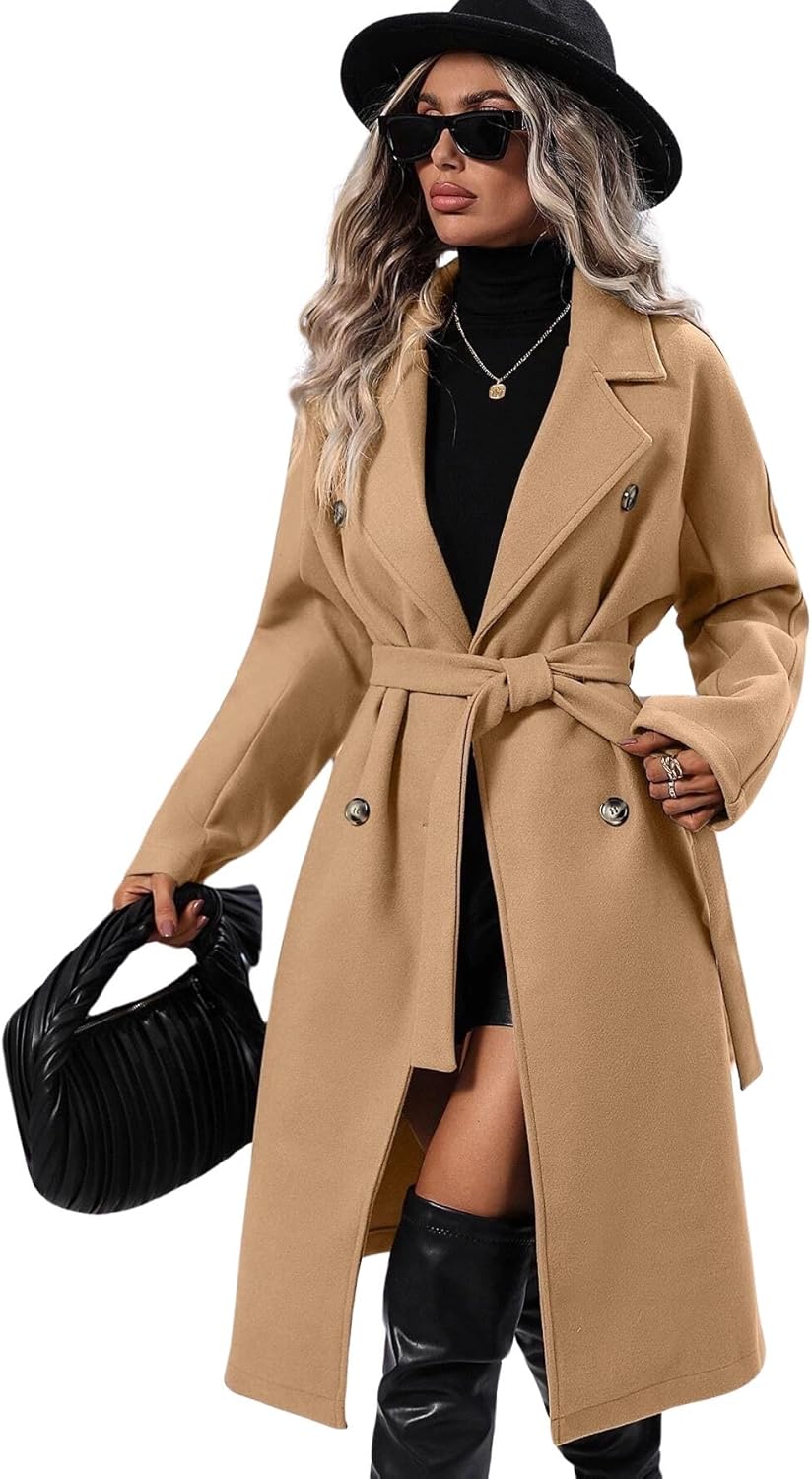
06 · Repeats camel
Camel
This is the one place in the entire capsule where dark and heavy are allowed to meet.
Why this worksLess
Camel is the darkest color in your palette, and it goes on the single heaviest thing you are buying, which means every other piece here can stay light without the outfit floating away. Spend on this one if you spend anywhere — it is doing more structural work than anything else on the page.
07 · Repeats camel
Camel
The second and last use of your one dark color, and the reason it is suede rather than a stiffer leather: your season’s own page already warns that hard tailoring and stiff leather read a size too serious on you, so the texture stays soft even where the color goes dark.
Why this worksLess
Pair it with the coat and you have used the capsule’s entire depth budget in two pieces.

08 · Repeats warm sand
Warm Sand
The anchor’s second appearance, and it does its job the same way the pant did — by simply showing up again.
Why this worksLess
Wear it with the aqua blouse and the coral cardigan and you have two warm pieces and one cool one, which is the exact ratio every outfit in this capsule is built on.

Skirt — the anchor, again
BTFBM long midi skirt, Beige
Warm Sand
4.1★ (2,438 ratings)
Shop the warm sand09 · Repeats warm sand
Warm Sand
The anchor’s third appearance, and the easiest way to make an accessory match the capsule without thinking about it twice.
Why this worksLess
A neutral this light does not compete with anything else you are carrying — it just keeps showing up in the same warm sand as the pant and the skirt, which is what makes twelve separate pieces read as one wardrobe.

10 · Repeats buttercream
Buttercream
A warm white instead of a stark one, on your season’s own advice.
Why this worksLess
Your page calls for denim in a warm or light wash, because a stark dark indigo drops a weight at the hip that nothing else in this capsule is built to answer. Straight leg, not skinny, so the cut stays as easy as the color.

11 · Repeats pale aqua
Pale Aqua
A second, portable dose of the one color doing the temperature work in this capsule.
Why this worksLess
Add it to the coat-and-boots outfit or the plainest pant-and-tee combination and it does the same job either way — one cool note in an otherwise warm outfit, which is your version of a dark boot.

12 · The one metal
Soft Gold
The one metal on the page, and the easiest call in the whole capsule.
Why this worksLess
Gold is your metal, warming everything it sits near rather than cooling it the way silver would. Small enough that it never competes with the cool note doing the real work elsewhere — it is here to finish the outfit, not to argue with it.

The rule underneath it
It is not depth. It is temperature.
A palette is a set of jobs rather than a list of colors you are allowed to wear. Light Spring assigns five of them — your anchor neutral, the shade to wear at your face, your blush tone, your cool note, and your white. Those five are the first five pieces on this page, and they are the ones to get right before anything else.
Then the jobs run out, and there are still seven pieces to buy. On this palette, none of the seven bring in a new idea. They repeat one of the five you already have. Warm sand alone reappears twice more, on the skirt and the bag; buttercream reappears as jeans; pale aqua reappears as a scarf. Only camel and soft gold do anything the first five did not already do, and even camel is really an extension of the anchor’s job — it holds things together by being the one thing dark enough to ground the outfit.
Here is the part that does not exist on most season pages, because most palettes have a “your depth” role and this one does not. Nothing here is dark enough to do the grounding a dark boot usually does. So the palette answers with a different tool: temperature. Pale aqua is the only cool color among your five core colors — everything else, peach, coral, sand, buttercream, runs warm. One cool piece inside an almost entirely warm outfit gives the eye somewhere to land, the same way a dark boot does for someone whose palette actually has one. It is not a coincidence that it is the only core color with “cool” in its job description.
The one exception to all that lightness is camel, and it is allowed exactly two jobs: the coat and the boots, the two heaviest things in the capsule. That is deliberate, not an oversight. Weight and depth are only allowed to meet once, on the one piece built to carry both, so nothing else in the outfit has to be dark to hold its own next to it. Put camel on a third piece and it stops reading as the capsule’s one grounding note and starts reading as the outfit’s actual color, which would undo the point of a palette that does not have a depth role in the first place.
Which is also why this transfers, even though the colors will not. Every palette is short on something. Some are short on light, some are short on anything quiet at all, and yours is short on dark. Whatever a palette does not have is the thing its outfits have to solve for some other way, and the solution is never to fake the missing thing — it is to find whatever else can do its job. Your season page names your own roles. Fill those first, and let everything else repeat.
Still deciding
Common questions.
- Twelve pieces but only five jobs — what are the other seven doing?
- Repeating. Warm sand turns up three times across the twelve, buttercream and pale aqua twice each, and camel twice more on top of that. Only two of the last seven bring in a color that was not already doing a job: camel, which is really an extension of the anchor’s job, and soft gold, which is here because gold is your metal. A wardrobe does not coordinate because it contains twelve nice things. It coordinates because a small number of colors keep reappearing in different shapes.
- Why does temperature matter more than depth here?
- Because depth is not available. Six of the twelve palettes on the site carry a “your depth” role — a dark color built to ground an outfit — and Light Spring is one of the ones that does not. The darkest thing you own is camel, and even camel reads light next to real depth. So instead of a dark anchor, this palette uses temperature: pale aqua is the one cool color among your five core colors, and it does for your outfit what a dark boot does for someone whose palette actually has one — it gives the eye somewhere to land.
- My palette has ten colors. Why are only seven of them here?
- Salmon, Sky, and Mint are left out, and not for being wrong. All three are bright, clear colors built to be the loudest thing in an outfit — a one-piece-at-a-time job, not a foundation. A twelve-piece capsule is built on colors that can repeat quietly in the background, and a color whose whole purpose is to stand out does not do well repeated three times. All three belong in your closet. None of them belongs in the twelve pieces holding it together.
- Can I still wear a dark coat?
- You can — this page is not arguing that you should build your fall wardrobe around one. Camel is here because it is the darkest color your own palette actually gives you, and everything else in this capsule is built to sit next to it specifically. A dark coat in a color outside your palette will still keep you warm, but it does the grounding job with nothing around it built to answer it, which is closer to the problem this whole capsule exists to solve than a rule about coats to follow.
- I am not a Light Spring. Is any of this useful to me?
- The colors are not yours, but the method is. Every palette is short on something — yours might be short on light, or on anything quiet at all, and this one is short on dark. Whatever your palette is short on is the thing your outfits have to solve for some other way, and the answer is never to fake the missing piece. It is to find whatever else in your palette can do its job. Your season page names your own roles. Fill those first, then let everything else repeat.
Before you go
Get the rest of your season’s shopping list.
One short letter every few weeks — the pieces, the colors and the swaps for your season specifically, not all twelve. No spam, and you can leave whenever you like.
Issue 02 · September 2026Fall only sells you two redsRead it first
More for Light Spring
Your picks in the other guides.
- The fall wedding, by seasonYour pick: Buttercream
- You can change your top. You can’t change your blush.Your pick: Peach Perfect
- The right scarf color for your color seasonYour pick: Your accents
- The fall jacket, by seasonYour pick: The apricot
- Date night, by seasonYour color is in this guide
- Rust or wine? The deep red for your color seasonYour pick: Rust or wine
- The fall sweater, in the color that is actually yoursYour pick: A warm cream
- The right wash of jeans for your color seasonYour pick: The pale wash
- The right red lipstick for your color seasonYour pick: Tomato
- The best white for every color seasonYour pick: Bright Ivory
- The best coat color for every color seasonYour pick: Warm Sand
- The best blazer color for every color seasonYour pick: Ink Navy
Not Light Spring? Pick another season
Don’t know which one you are?
Find your season in a minute.
Upload a portrait and the analysis runs entirely in your browser. Your photo never leaves your device — there’s no server to send it to.
Find my colorsUndertone, depth and contrast are what decide which of the four neutrals is yours. The analysis measures all three rather than asking you to guess from a description.