Shop the video
Rust or wine? The deep red for your color season
Two deep reds, and for the next three months you cannot walk past a shop window without meeting one of them. They look like variations on a theme. They are not: rust is a red warmed with earth, wine is a red cooled with plum, and they behave like opposites the moment either one gets near your face. There are four reds here, not two, and every one of the twelve seasons has one. What follows is four things worth owning this fall, each in the red that belongs to you.
The pieces below are Amazon links, and Your Style Hue earns a commission if you buy through one — at no extra cost to you. Nothing here is paid placement. Each piece was chosen because its color actually matches the shade it sits under. Most come in a dozen colors, so check the one on Amazon matches before you buy.
The answer for every season · tap yours
Start here
Four reds. Which one is yours.
Rust and wine are the two the shops are selling, and between them they only cover half of us. The other two are the ones the shop wall skips — and they are not consolation prizes. Each of them is precisely the red the other group has to avoid.
01 · If your coloring is warm and earthy
Rust
A red with earth already in it — the color of a leaf that turned a fortnight ago rather than a fire engine. It puts warmth back into a face that everything cool drains. Soft Autumn, yours is rust with the volume down. Deep Autumn, take the oxblood end of it rather than the pumpkin end.
02 · If your coloring is cool and deep
Wine
A red pulled toward plum and held there — deep, cool, and heavy enough to meet Winter coloring instead of sitting under it. If rust made your skin look slightly grey, this is why. Bright Winter, you are here for the temperature rather than the depth: yours is the cold, clear version of the idea.
03 · If your coloring is cool and soft
Cool burgundy
Wine, with the weight taken out of it. The temperature of wine is already right for you, but Summer is soft, and a full-strength wine closes your face down rather than lifting it. Lift it a few steps, leave the coolness alone, and you have a dusty berry that behaves like a neutral on you. Light Summer, take it furthest — you are not too pale for a deep red, the weight is the problem.
04 · If your coloring is warm and clear
Tomato red
Spring skips both of the shop-window reds, and this is the one you have been looking for instead. Rust and wine are both darkened reds, and darkening is the single thing Spring coloring will not survive. Your red keeps its light: clear, warm and bright, the red of a tomato rather than of a brick. Read the note further down before you shop for it this season.
01 · The one you will wear most
The quarter-zip sweater
A rib-knit quarter zip is the most useful thing on this page, because the collar stands up and puts the color right under your chin whether you zip it or not. It is also the fastest way to find out whether a red is yours: wear one for a day and look at a photograph of yourself at the end of it. The right red makes your face look a little more even, as though you slept well. The wrong one drops a faint grey into your skin.
The accessible oneRib knit rather than wool, and it photographs as a cozy fall sweater rather than a spring top.
Rust
True, Soft and Deep Autumn
4.2★ (2,721 ratings)
Shop the rustWine
Deep, True and Bright Winter
4.2★ (2,721 ratings)
Shop the wineCool burgundy
True, Soft and Light Summer
4.5★ (3,193 ratings)
A different sweater, and a cotton cable knit rather than a rib — because the quarter zip above has no cool red in it at all. See the note below.
Shop the cool burgundy
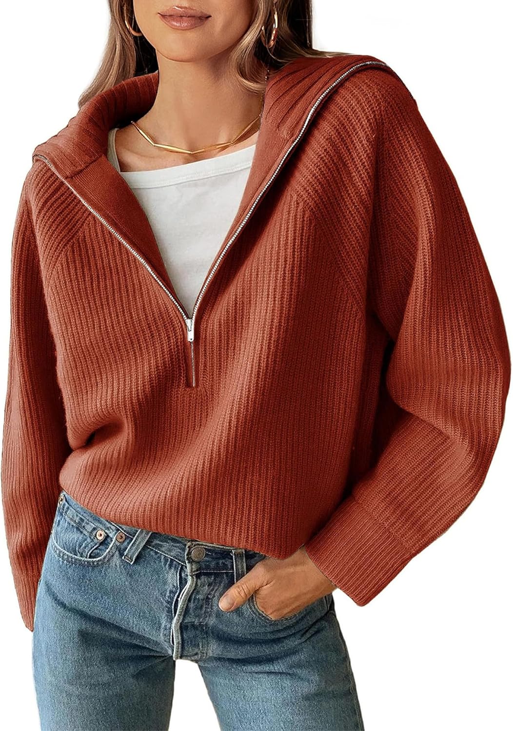

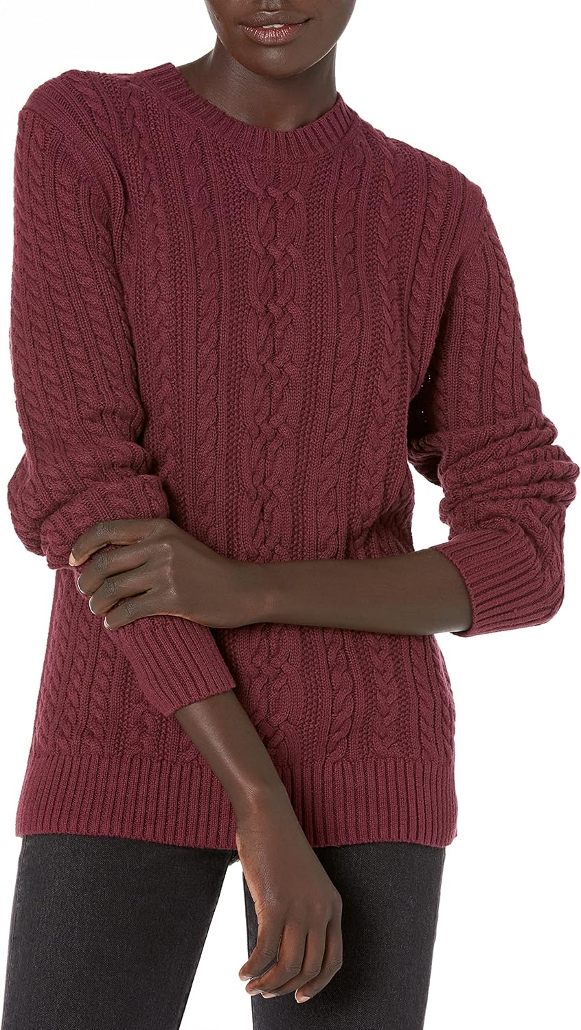
The Summers get a different sweater, and the reason is worth knowing: this brand’s rust and wine are both genuinely good, but its dye range simply stops short of cool. Its nearest thing to a cool burgundy is far enough off that it would put grey into a Summer face, so the Summers get a cotton cable knit instead. Naming it rather than stretching one listing to cover everybody is the whole point of the page.
02 · The one that does the most work
The faux-suede jacket
Suede is the fabric that makes an outfit read as fall, and a matte nap does something useful with a deep red: it scatters light instead of bouncing it, so the color sits quieter in a room than it looks on a screen. This one is an open-front waterfall with no closure at all, which matters more than it sounds — whatever you wear underneath is what is actually at your face, so the layer under the lapel is a free lever if the jacket runs a shade brighter than your own version of the color.
The accessible oneA stretch faux suede, not an heirloom — and it carries the two closest color matches on this page.
Rust
True, Soft and Deep Autumn
4.0★ (1,635 ratings)
Amazon calls this one “Brown.” It is the rust — see the note below.
Shop the rustWine
Deep, True and Bright Winter
4.0★ (1,635 ratings)
Sold as “Purple Red.” There is no purple in it.
Shop the wineCool burgundy
True, Soft and Light Summer
4.0★ (1,635 ratings)
The softest call on the page, and an honest one: this runs a little warmer than a true cool burgundy. Keep a cool neutral at the collar and the open front does the rest.
Shop the cool burgundy


Now look at what this listing calls these colors. The rust is sold as “Brown.” The one actually named “Rust Red” is a brick, and it is the one color on that listing a warm, earthy coloring should skip. And the wine is sold as “Purple Red,” which has no purple in it whatsoever. That is not carelessness on one listing — a brand color name describes the dye bath, not what the color does at your face, and the two are routinely different things. It is exactly why every color on this page was measured off the photograph rather than read off the label.
Two down, two to go
Not sure which of these is describing you?
That’s the normal answer, and it’s the whole reason the analysis exists. It reads your undertone, depth and contrast from a photograph and tells you which of the twelve seasons you are — which settles the rust or wine question in about a minute.
03 · The one for the evening
The satin top
Satin is the one fabric on this page that changes the color rather than just carrying it. The sheen lifts a deep red a step every time the light moves, which is why a wine satin reads rich in a restaurant and nearly black in a photograph — and why it is worth owning your version rather than a near miss. A long-sleeve button-down goes out in October in a way a summer cami does not, and the cami is here as the cheap way in.
The high and the lowA dressy satin button-down, and a satin cami for a fraction of it. Same fabric family, two different evenings.
Wine
Deep, True and Bright Winter
4.2★ (4,826 ratings)
The most accurate color on the whole page.
Shop the wineRust
True, Soft and Deep Autumn
4.3★ (12,778 ratings)
A cami rather than a blouse, and the cheapest thing on this page. Sold as “Caramel,” and it is not a caramel.
Shop the rust


There is no cool burgundy in this one, and no tomato. The blouse’s wine is a warm wine rather than a dusty cool one, which at the neckline is a near miss rather than a match, so the Summers are better served by the sweater or the jacket above. The rust is a judgment call too: satin sheen makes the measurement move depending on how the light falls, so treat that one as in the rust family rather than as an exact hit.
04 · The one you can relax about
The leather bag
A bag is the only thing on this page that never goes near your face, and that changes the rules in your favor. There is still a best red for you — a bag has to live with your coat, your boots and your lipstick, and a warm rust against a cool wardrobe will always look like it came from somebody else’s closet. But the margin around that best answer is much wider than it is at your collar, because nothing here reflects up into your skin. If you are between two seasons and tired of choosing, this is the item to buy first.
The splurge, and the bargainGenuine leather at the top of the block, and a matte vegan hobo for a third of it. Worth saying which way that cuts: the cheap matte one photographs its own color more honestly than the expensive shiny ones do, because a gloss finish throws highlights that read as a lighter shade.
Rust
True, Soft and Deep Autumn
4.4★ (5,420 ratings)
Sold as “Sorrel.” On the bright, terracotta edge of rust.
Shop the rustThe splurge version
S-ZONE vintage genuine leather tote, “Brandy”
4.6★ (3,180 ratings)
The most accurate rust of any bag checked, and it held its color across every part of the photograph. A bigger, softer work tote.
Shop the splurgeWine
Deep, True and Bright Winter
4.4★ (5,420 ratings)
Shop the wineThe inexpensive version
Montana West soft hobo with crossbody strap, “Burgundy”
4.5★ (1,756 ratings)
Vegan leather, and matte rather than glossy — which is why its color reads more honestly in a photograph than either of the leather bags above.
Shop the inexpensive oneCool burgundy
True, Soft and Light Summer
4.4★ (1,120 ratings)
A different bag, and sold as “Wine Red” — which it is not. It is the truest cool burgundy found anywhere in this search, on a label that names the wrong color.
Shop the cool burgundy


This is the block where the numbers were softest, and for a reason worth knowing: leather is shiny, and a highlight on a deep red reads as a lighter, less saturated color than the bag actually is. So these were measured across several panels rather than one, and the rust in particular sits on the bright edge of rust — closer to terracotta than to the swatch, honestly. At a neckline that gap would matter. At hip level nobody will ever see it next to your face.
If you are a Spring
Your red isn’t in the shops this season.
Every other season on this page gets something to buy. You get an explanation, and it is a better use of your money.
Your red is a clear, warm, undarkened one — the red of a tomato rather than of a brick or a glass of wine. Rust and wine are both reds that have been taken somewhere dark, and darkening is the single thing your coloring will not survive. So the two colors filling every window right now are the two you should walk past.
Here is the part nobody tells you. Four categories were searched to build this page — sweaters, jackets, tops and bags — and roughly two hundred items were measured against the palette rather than judged by eye. Not one of them was a tomato red. The closest thing found in the whole search was a satin top, and measured properly it turned out to be a clean true red: lovely, and not your color.
There is a reason, and it is oddly specific. Autumn stock arrives in two groups. One is the blue-based reds — cherry, crimson, true red — which are deep and cool and land well away from you. The other is the oranges and corals, which are bright enough but too light and too yellow. A clear tomato sits in the gap between those two groups, and in the fall almost nobody dyes it.
So what to do instead. Two honest answers, and neither of them is a compromise. The first is to take the clear true red anyway, knowing what you are doing — it is the nearest real thing to your red, it is genuinely wearable on a Bright Spring, and calling it a substitution rather than a match is the whole difference between choosing and settling. The second, and the one worth considering, is to skip red altogether until spring. Your palette carries a coral and a warm turquoise that no other season can wear the way you can, and a season is not obliged to buy the thing the shops happen to be pushing.
When a clear tomato does come back around — and it does, every spring — you will know it on sight, because you will have spent a winter not buying the wrong one.
The rule underneath it
Rust and wine are the same idea in opposite temperatures.
Both of them are a deep red that has been taken somewhere. Rust is a red walked toward earth until it picks up the warmth of clay and dry leaves. Wine is the same red walked toward plum until it goes cool and a little severe. That is the entire difference between them, and it is why they belong on one page instead of two — you are not choosing between two colors so much as choosing a direction.
Once you can see that, the other two blocks stop looking like exceptions. The Summers need the direction wine went, without the weight it picked up on the way. The Springs need a red that was never taken anywhere at all — one that kept its light instead of trading it for depth. Four reds, one axis running warm to cool, and a second running deep to light. Your season sits at one crossing of the two.
This is also why the shop wall in autumn feels so unhelpful. It is not showing you a hundred reds. It is showing you two, over and over, in a season when half the people looking at them want the other two. Knowing which of the four is yours turns a wall of red into one rail worth walking to.
Still deciding
Common questions.
- How do I tell which one is doing me a favor?
- Watch your skin, not the fabric. Hold each one up under your chin in daylight and look at the area under your eyes and around your mouth rather than at the color itself. The right red makes your face look a little warmer and more even, as though you have slept. The wrong one drops a faint grey or a faint yellow into your skin and pulls attention to shadows. The effect is usually obvious within a couple of seconds, and it is much easier to see with two reds side by side than with one on its own.
- The video only said rust and wine. Why are there four reds here?
- Because rust and wine between them only cover the Autumns and the Winters, and that is six of twelve. Both of them are darkened reds. The seasons left over are the ones that cannot take a darkened red at all: the Summers, who need the coolness of wine without its weight, and the Springs, who need a red that has kept its light. Adding those two is not padding to reach twelve — each one is precisely the color the other group must not wear. Cool burgundy sits on Light Spring’s avoid list, and the clear tomato sits on True Summer’s.
- Why is there nothing to buy in tomato red?
- Because it is not being sold this season, and we would rather say so than sell you a near miss. Four categories were searched for this page and roughly two hundred items were measured, and nothing came close enough to call a tomato. There is a reason: autumn stock splits into blue-based reds, which are too dark and too cool, and oranges and corals, which are too light and too warm. A clear tomato sits between those two groups and almost nobody dyes it in the fall. The section further up says what to do instead.
- Amazon calls this jacket “Brown” and you are calling it rust. Which is it?
- Rust — and the difference between those two answers is the whole reason this page exists. A color name on a listing describes the dye bath the fabric went into. It does not describe what the color does when it is near your face, and the two come apart constantly. On that same listing, the color actually named “Rust Red” is a brick, which is the one a warm, earthy coloring should skip, and the wine is sold as “Purple Red” with no purple in it. Every color on this page was measured off the product photograph instead of read off the label, which is why the names and the bands disagree in places.
- Why is the Summers’ sweater a different brand from everyone else’s?
- Because the quarter zip does not come in a cool red. Its rust and its wine are both good, but its nearest thing to a cool burgundy is far enough off that it would put grey into a Summer face rather than lifting it. The choice was to stretch one listing to cover everybody or to name a second sweater for the seasons it does not serve, and the second is the honest one. The cotton cable knit named in that band is the best cool burgundy found in the category.
- Does the bag have to match as exactly as the sweater?
- No, and the reason is physical rather than a matter of taste. A color near your collar reflects up into your skin, which is the whole mechanism this system runs on. A bag at hip level does not, so it only has to live with the rest of what you are wearing. There is still a best red for you — a warm rust against an otherwise cool wardrobe looks borrowed — but the margin around that best answer is much wider. If you are on the border between two seasons, a bag is the easiest thing you will ever buy.
- I am between two seasons. Which red do I buy?
- Start with what the two seasons agree on. If you are between two Summers, the cool burgundy is right either way and the only question is how far up in lightness you take it. If you are between a Summer and an Autumn you are on the warm and cool line, which is the real fork, and the answer is whichever your own coloring does — hold a rust and a cool burgundy up at a window and one of them will settle down while the other fights you. And if you would rather not decide today, buy the bag.
Before you go
Get the rest of your season’s shopping list.
One short letter every few weeks — the pieces, the colors and the swaps for your season specifically, not all twelve. No spam, and you can leave whenever you like.
Issue 02 · September 2026Fall only sells you two redsRead it first
Keep shopping
Everything for your season.
Pick your season to see every guide's answer for you, in one place.
Don’t know which one you are?
Find your season in a minute.
Upload a portrait and the analysis runs entirely in your browser. Your photo never leaves your device — there’s no server to send it to.
Find my colorsUndertone, depth and contrast are what decide which of the four neutrals is yours. The analysis measures all three rather than asking you to guess from a description.