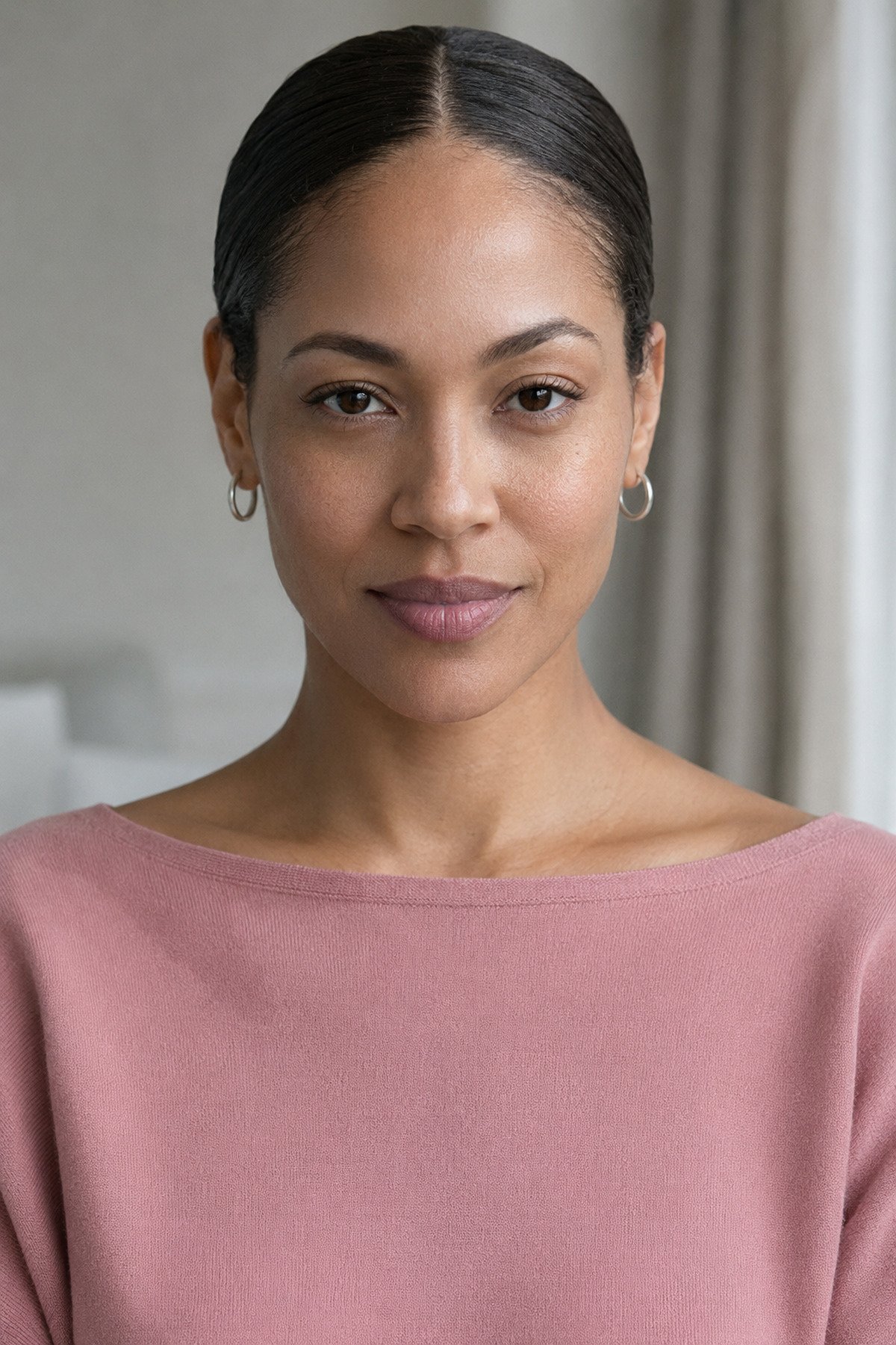
Summer · True
True Summer
Also called Cool Summer.
Cool, soft, watercolor. Your five anchor colors, what to wear at your face, and the pieces worth buying.
Shop this paletteSummer · True
True Summer
Also called Cool Summer.
Cool, soft, watercolor. Your five anchor colors, what to wear at your face, and the pieces worth buying.
Your core five
The colors that do the work.
Build the wardrobe on these. Everything else is a variation.
Dusty BlueYour anchor
Cool RoseWear at the face
SageYour neutral green
MauveYour depth
BoneYour white
Accents lift an outfit, they don't lead it. Save the palette to your phone for the fitting room.
This week's edit
In your palette right now.
A few pieces that work on True Summer coloring. Your Style Hue earns a commission on qualifying purchases, at no extra cost to you.


Is this you?
Three checks you can do right now.
Stand near a window, no makeup if you can manage it. Two out of three is a strong signal.
01
Silver or gold?
Hold a silver piece to your jaw, then a gold one. Watch your skin, not the metal.
silver vs. goldTrue Summer ifSilver settles into your skin and gold sits on top of it, casting a faint yellow shadow under your chin.
02
Does black take over?
Put on a pure black top. Then swap it for charcoal or slate blue and look again.
True Summer ifBlack is the first thing you see in the mirror, and the charcoal or slate lets your face come forward.
03
Crayon or watercolor?
Find a clear bright blue — cornflower, royal, anything that looks like it came out of a paintbox. Hold your dustiest blue next to it.
True Summer ifThe clear blue puts a hard edge around your face, and the greyed one softens the line between your skin and the fabric.
If it’s close
The three you might be instead.
- Light SummerYou, lighter. Powder blue and pale pink hold their own on her; on you they thin out and dusty rose does the work.
- Soft SummerYou, foggier. If true periwinkle reads slightly loud rather than right, you are Soft rather than True.
- True WinterYour cool cousin at full volume. She carries true black and snow white; those same two flatten you.
The reading
Cool, but never stark.
You’re the one who wears dusty rose and watercolor blue and looks like a Victorian oil painting. Cool ash-blonde or ash-brown hair with no gold in it, fair-to-mid skin with a pink cast, blue or grey-green eyes. You burn before you tan, and when you do tan it comes up rosy rather than golden. You’ve probably been told you look “classic” — which is your coloring doing quiet work in clothes that would flatten most people.
Here’s the part nobody tells you: the “Summer wears pastels” advice online is half right. You wear cool pastels beautifully, but not at full clarity. Yours need a touch of grey, a hint of antique. Powder blue instead of baby blue, dusty rose instead of candy pink, slate instead of black. Watercolor, not crayon.
Your superpower is layering two or three muted cool tones together and reading deliberate rather than busy. Mauve with periwinkle. Sage over dusty blue. Slate against soft burgundy. Where a Winter needs one bright note on a plain field, you can build the whole outfit out of fog. The palette of an English garden after rain.
If you’ve always reached for cool muted tones and felt a small tension in anything bright or warm — welcome. You’ve been right. The rest is permission and refinement.
Same color, your version
Swap it, don’t skip it.
Almost nothing is off-limits. It is about which version of a color belongs to you.
- Instead ofBlack & optic whiteSlate & boneYour neutrals.
Pure black against pure white sets a contrast level your face does not have, so the outfit reads first and you read second. Slate and bone do the same job at your volume.
- Instead ofTomato red & mustardCool burgundy & mauveDepth without heat.
Warm pigment pulls the yellow up in your skin and leaves the pink stranded. Take the same depth and swing it blue, and it reads rich instead of ruddy.
- Instead ofClear pastelsPeriwinkle & cool roseWatercolor, not crayon.
This is where the "Summer wears pastels" advice goes wrong. A pastel at full clarity has more brightness than your face does, so it looks sweet on the hanger and slightly costume on you. Add grey and it settles.
- Instead ofCamel & cognacDusty blue & sageThe coat and the knit.
Camel is sold as a universal neutral and it is not — it is a warm one, and warm neutrals grey you out faster than any bright color will. Cool your neutrals and the whole wardrobe stops fighting.
The details
Denim, metals, prints.
Denim
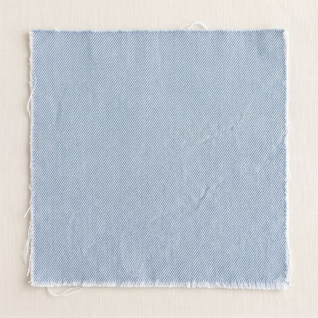 Light cool
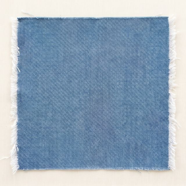 Mid cool
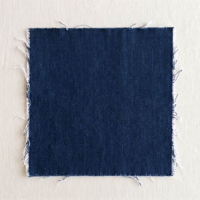 Dark cool
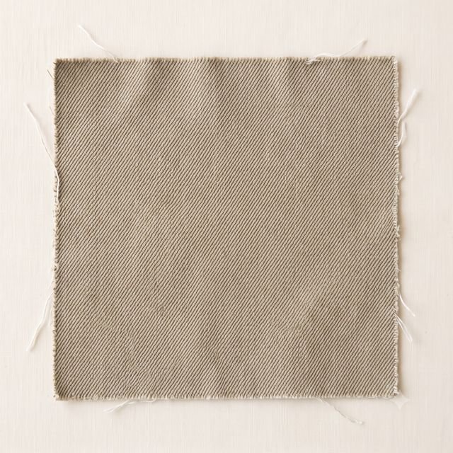 Vintage warm · not this
A light cool wash, a mid cool blue, a dark cool indigo. Vintage warm denim — the sun-baked wash with tan in it — is the one to leave. Your blues should look like fog, not sand.
Metals
- Silver
- White gold
- Pewter
- Yellow gold
Silver, white gold, platinum, pewter. Pale pink-leaning rose gold works too. Yellow gold reads warm against a cool face and puts a yellow cast where you want none.
Prints
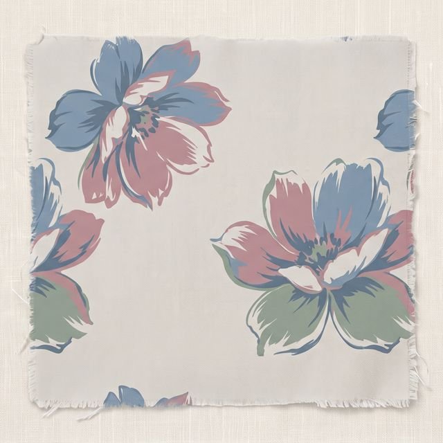 Cool floral
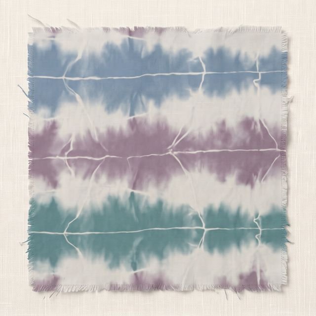 Shibori
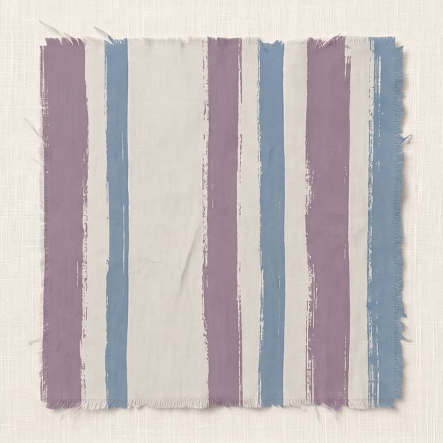 Painted stripe
Watercolor florals in cool colors, soft plaid, tonal stripe. Look for prints that read English garden rather than graphic — hard black-and-white patterns and bold warm prints are both too stark next to your face.
Fabric
Cashmere, silk, fine wool, linen. Your aesthetic is quiet luxury — pieces that look expensive without announcing it, in fabrics that drape rather than stand at attention. Stiff structured shapes feel slightly off; soft tailoring with gentle lines is your truest silhouette.
Build the base
The staples worth owning.
Six pieces that make a True Summer wardrobe work. Get these in your colors and everything you already own starts coordinating with everything else.
- Slate coat
- Dusty-blue cashmere
- Bone pant — not white
- Cool-rose silk blouse
- Burgundy boot or bag
- Brushed-silver everyday jewelry
Where I’d start, if you’re filling gaps. Your Style Hue earns a commission on qualifying purchases, at no extra cost to you.


Reference points
Women who read this way.
Working hypotheses from photographs, not formal drapings — useful for training your eye.
Kate Middleton
The defining reference. Recurring dusty blue, soft pink, mauve, ivory, the occasional cool burgundy — the palette repeats in every official portrait.
Cate Blanchett
Cool slate, dusty blue, soft burgundy, pewter. In warm tones she is interesting but less luminous.
Renée Zellweger
At her natural blonde-to-ash coloring. Soft pink knits, dusty blue, gentle mauve.
Naomi Watts
Dusty mauve, slate blue, soft burgundy, periwinkle. Warm tones mute her; cool soft tones wake her up.
Holly Hunter
Fair skin, cool features, muted cool palettes. True Summer in real-world wear — neither flamboyant nor invisible.
The common thread is cool and soft together. Once you see the True Summer effect, you’ll spot it on every “she always looks quietly right” woman you can name.
Still deciding
Common questions.
- Is True Summer the same as Cool Summer?
- Yes. Cool Summer and True Summer are two names for the same season, from two ways of naming the twelve. One names a season by where it sits in the system, the other by what the coloring looks like. Your Style Hue uses True Summer throughout. If you were told you are a Cool Summer, this is your page and this is your palette.
- True Summer or Soft Summer?
- Both cool, both softened. True Summer is clearer; Soft Summer is foggier still. A True Summer can wear a dusty blue at full strength, where a Soft Summer needs it greyed down another step. Quick test — if true periwinkle feels right rather than slightly loud, you are True Summer.
- True Summer or Light Summer?
- Both cool Summers. Light Summer is lighter overall — paler skin, lighter natural hair, pastels at full clarity. True Summer is a touch deeper and more saturated. If pure baby pink reads almost cute on you, Light Summer. If you reach past it for dusty rose, True.
- True Summer or True Winter?
- Both cool. True Winter is the dramatic version — high contrast, strong saturation, true black and snow white. True Summer is the soft version — low-to-mid contrast, muted saturation, dusty cool tones. If icy pure white looks beautiful on you, consider True Winter. If soft cream looks better, you are True Summer.
- Can I wear black?
- Not pure black at your face — it builds a contrast level your coloring does not have and can leave you looking tired. Charcoal is much better, navy works, cool burgundy works. If a dress code requires true black, break it at the neckline with a soft scarf, pearls, or silver that catches light.
- Best lipstick shade?
- Cool rose, mauve, dusty pink, cool berry, soft burgundy. Look for "rose," "mauve," "berry," "cool nude." Skip coral, warm peach, brown-nude and true bright red — all too warm. MAC Faux, Charlotte Tilbury Pillow Talk Original and NARS Anna are the right family.
- I am going grey. Should I color my hair?
- Many True Summers look better silver than they did with their natural color — the cool grey mirrors your undertone and reads luminous. If you want to keep coloring, stay cool: ash blonde, cool brown, no warm highlights. Silver is usually an upgrade rather than a compromise here.
- Why does pure white wash me out?
- Pure white carries more clarity and contrast than your coloring does, so it draws the light away from your face. Bone, cream or a soft off-white sits closer to your skin and reads much better. The whites that flatter you look antique rather than crisp.
From the Journal
Reading on the method.
If this season feels close but not quite yours, the journal goes deeper on how the 12-Season system works and how to confirm your reading.
Why your season has three different names
Cool Summer, Dark Winter, Muted Autumn — the alternate names for the twelve, and why "cool" alone never identifies a season.
Read the note →
Personal color analysis, explained
A primer on what color analysis is, where it comes from, and what changes when you use it.
Read the note →
Find your season at home
A 20-minute step-by-step that gets you to your season with a stack of fabric and a mirror.
Read the note →
Warm or cool undertone? Five at-home tests
Triangulate across five tests to find your undertone — wrist, white-vs-cream, gold-vs-silver, sun reaction, foundation history.
Read the note →
The twelve seasons, read closely
A walking tour of all twelve seasons — what each one means and the mood behind each palette.
Read the note →
Shop this season
Everything picked for True Summer.
13 shopping guides answer True Summer, from the coat to the red lipstick, each in the True Summer color. There's a whole True Summer fall capsule too.
Not sure this is your season?
Find out in a minute, then get the letters for yours.
The analysis reads your own photograph and names one of the twelve — it takes about a minute and nothing leaves your device. Leave your address and you'll get one short letter every few weeks: what to wear at your face, and what to pair it with.
Issue 02 · September 2026Fall only sells you two redsRead it first
Not sure this is you?
Find your season in a minute.
Upload a portrait and the analysis runs entirely in your browser. Your photo never leaves your device — there’s no server to send it to.
Find my colorsTrue Summer is one of twelve. If your coloring sits on a border — and plenty do — the analysis measures undertone, depth and how clear or muted you are rather than guessing from a description.