The Journal · The Primer
Personal color analysis,
explained.
By the Your Style Hue editors · Published May 20, 2026 · 14 min read
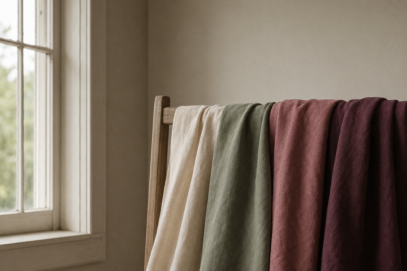
You have probably noticed that some colors make you look better than others. A particular shade of red makes your skin look fresh and rested; another shade — sometimes nearly identical to the eye — makes you look like you skipped sleep. There is a reason for this, and it turns out to be predictable rather than mysterious.
Personal color analysis is the systematic study of which colors flatter a particular person based on their natural coloring — skin undertone, hair pigment, and eye color taken together. The modern system organizes its findings into twelve specific "seasons," each with a palette of flattering colors and a much larger set to avoid. Knowing your season tells you, before you try anything on, which clothes will sing on you and which will not.
This article is the primer. It covers what personal color analysis actually is, where it comes from, how the modern 12-Season system works, why it works, what changes when you start using it, and how to get your own reading. If you have never encountered any of this before, you are in the right place.
The basic idea
Color analysis began with an observation that almost everyone has had: some colors flatter you, others do not. A specific yellow can make you look luminous; a yellow two shades over can make your skin look sickly. A coral lipstick can transform your face; a pink one can make you look washed out.
For most of history, this stayed at the level of intuition. Mothers, sisters, stylists, and friends would tell you what suited you, and you would either learn it through trial and error or never quite figure it out. There was no system. You either had a good eye for what worked on you, or you did not.
Color theorists in the twentieth century asked a different question. Was the pattern of which colors suit a person predictable — could it be derived from something about the person rather than from trial-and-error wardrobe building? The answer turned out to be yes, with surprising reliability, by reading three properties of a person's natural coloring.
What emerged was a system: every person has a "palette" of colors that work on them, and a much larger set that does not. The good colors share a quality that harmonizes with the person's own pigmentation. The bad ones fight it. The system gave practitioners a way to identify a person's palette in an hour, rather than the decade of wardrobe trial-and-error that most women otherwise spend.
Where it comes from
The intellectual roots run back to early color theory — Goethe in the late 1700s, and the Bauhaus painter Johannes Itten in the 1920s. Both argued that colors have inherent relationships with each other, and that some combinations harmonize while others clash. Itten in particular noticed that his students seemed to paint best with palettes that matched their own coloring. He grouped them into four "color types" — and the four-season language was born.
The American color consultant Suzanne Caygill picked up the thread in the 1940s and 1950s, systematizing the four-season idea into a consulting practice for women's clothing. By the 1970s the system was being taught and adapted by multiple practitioners. Then in 1980, the journalist Carole Jackson published Color Me Beautiful, which translated the four-season system for a mass audience. The book sold more than ten million copies. For an entire generation of women, that was when "your colors" became a familiar concept.
The four-season system was useful but rough. Practitioners noticed that most clients did not fit cleanly into one of the four — they sat somewhere on the edge between two. A woman with golden hair and fair pink-toned skin was neither pure Spring nor pure Summer. By the late 1980s and into the 1990s, color analysts began refining the system into twelve sub-seasons (and later, sixteen — though twelve has become the most widely-used standard). Each of the four parent families got three sub-divisions, capturing where a person sits within her family. The result is the 12-Season system used today.
Today, thousands of consultants worldwide work in the 12-Season tradition, and the system is the de-facto standard in modern personal color analysis. It is what this site is built on.
What actually happens in a reading
A traditional in-person reading is a quiet, almost meditative process. You arrive at a studio. The consultant has you wash off any makeup and pull your hair back. You sit in front of a mirror, in north-facing daylight if possible. The consultant has a collection of large fabric swatches — usually fifty to ninety — covering the full range of colors across all twelve seasons.
One at a time, she drapes each fabric under your chin, against your collarbone. She watches your face. The question is not whether you "like" the color — it is whether the color makes your skin read fresher or more tired, whether your eyes pop or dim, whether your face looks balanced or sallow. She sorts each swatch into a "yes," "no," or "maybe" pile, and at the end of forty-five to ninety minutes, the pattern in your "yes" pile tells her your season.
You leave with a swatch wallet — a small fan of fabrics in your palette — that you can take shopping. Some consultants also offer wardrobe walk-throughs, makeup recommendations, or hair color advice. The full session typically runs $200 to $500 and takes one to two hours.
That traditional method is still excellent and is what trained consultants offer worldwide. But it is not the only way.
Modern alternatives have multiplied in the last decade:
- — Online photo-based readings that sample actual color values from a portrait and run the same three-axis classification a consultant runs by eye (this is what we offer here).
- — Group "draping parties" where friends drape each other.
- — Home draping, where you use a stack of large fabric or t-shirt swatches in front of a mirror in good daylight — slower than a professional reading but quite reliable. We have a step-by-step guide for the home version.
- — Simpler "warm or cool" undertone quizzes that get you one-third of the way to your season — see our undertone primer for the full method.
Each method has trade-offs of accuracy versus cost versus convenience. None of them — including a $500 professional session — is more than 98% accurate, because color analysis is an empirical practice rather than an exact science. But all of them, done thoughtfully, will get you to the right season frequently enough to meaningfully change how you dress.
The 12-Season system, briefly
The whole system reduces to three readings, taken together. Each reading places you on an axis; the three axes combine into one of twelve seasons.
- Undertone — warm, cool, or neutral. The hue underneath your skin. (Covered in detail in our undertone primer.)
- Depth — light, medium, or deep. The combined pigment density of your skin, hair, and eyes.
- Chroma — clear or muted. How saturated or softened your coloring reads.
The twelve seasons that emerge:
- — Spring (warm + clear): Light Spring, True Spring, Bright Spring
- — Summer (cool + soft): Light Summer, True Summer, Soft Summer
- — Autumn (warm + muted): Soft Autumn, True Autumn, Deep Autumn
- — Winter (cool + clear): Bright Winter, True Winter, Deep Winter
SpringWarm · clear
SummerCool · soft
AutumnWarm · muted
WinterCool · clear
The "True" version of each family is the purest expression — that person sits at the dead center of her family. The other two sit on either side, leaning toward an adjacent family and picking up some of its character. A Bright Spring borrows clarity from neighboring Winter. A Soft Autumn borrows muted softness from neighboring Summer. Each season has its own palette — a set of colors that flatter — and its own list of colors to avoid.
For the full walking tour of all twelve, with profiles of each, see our field guide to the twelve color seasons. For just your own season, the in-browser reading at the top of this site takes about a minute.
Why it works — the physics, briefly
The reason a "right" color makes you look fresh, and a "wrong" color makes you look tired, is not aesthetic preference. It is optics. Specifically, it is what happens to light when it bounces off fabric and onto your face.
Every color you wear reflects a portion of the light hitting it back at your face. That reflected light is tinted in the fabric's hue. A red shirt bounces red-tinted light onto your jaw. A yellow sweater bounces yellow-tinted light. Your face, no matter what else is happening, gets a faint wash of whatever color you have on.
Your skin already has its own pigmentation — a mix of yellow, pink, brown, and red undertones that combine to make your individual coloring. When the light-wash from your shirt harmonizes with that pigmentation, the combined result reads as "you, looking healthy." When it fights it — adding cool light to warm skin, or muddying clear skin with dusty light — the combined result reads as "you, looking off."
This is observable and measurable. Stand in front of a mirror holding a true-red fabric and a brick-red fabric, both in daylight, both directly under your face. The difference in how your skin reads under each one is striking and obvious. You are not imagining it. The reflected light from each fabric is literally a different wavelength composition, and your skin is responding to that physically.
True red
Blue-based. Bounces cool light up onto the jaw — clarifying on cool skin, draining on warm.
Rust
Orange-based. The same nominal red, warmed. Settles warm skin; on cool skin it muddies.
The 12-Season system codifies which color families produce harmonizing light for which natural pigmentation patterns. It is empirical — derived from practitioners observing thousands of skin-and-color interactions over forty years — not theoretical. Whether or not the system is "elegant" in some abstract sense, it works the way it claims to.
You look like the best-rested version of yourself.
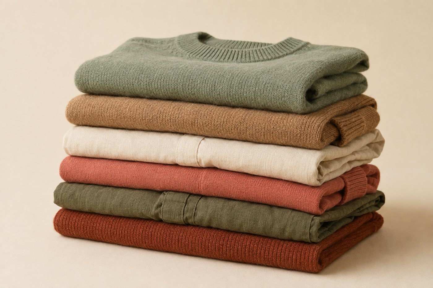
What actually changes when you start using it
The practical changes, in roughly the order most people notice them:
You look more rested without changing anything else
This is the first thing. You put on a shirt in your palette and people start commenting on you, not on your outfit. "You look great today" rather than "love that shirt." Sleep, exercise, water, makeup — none of it has changed. What changed is the light-wash you are putting on your face. Healthy. Awake. The you you remember from your best day this year.
Shopping becomes dramatically faster
Most clothing in any store is in "wrong" colors for you — because most clothing in any store is in wrong colors for everyone except the lucky one-twelfth of the population whose season the buyer happened to be targeting. Once you know your palette, you can walk through a store and rule out 70-80% of the racks in seconds. The remaining 20-30% is where your attention goes. Shopping trips that used to take three hours take forty-five minutes.
Your wardrobe becomes more cohesive
A wardrobe built from your palette has an internal logic — every piece pairs with every other piece because they all share the same warm-or-cool, clear-or-muted quality. The "I have nothing to wear" problem fades because everything works with everything, so any combination feels intentional.
Makeup and hair decisions get easier
Lipstick, blush, foundation undertones, hair color, even nail polish — all the same principles apply. A True Winter looks stunning in a true-red lipstick and looks unwell in a coral. A Soft Autumn glows in a warm brown lipstick and looks washed out in a pure pink. Once you know your season, makeup shopping becomes much less guesswork.
What it does not do
It is worth being clear what color analysis is not for:
- — It does not dictate your style. You can be a minimalist or a maximalist, classic or avant-garde, in any palette. Color analysis is about which colors; style is about everything else.
- — It does not change. Your season is your season for life. Hair color, skin color, age — surface details — change, but the underlying coloring does not.
- — It does not mean you can never wear a "wrong" color. The rule is simply that your palette is where you look your best. Plenty of women happily wear off-season colors in small doses (scarves, accessories) without consequence. The art is in knowing the difference.
Common misconceptions
"Anyone can wear any color if it is the right shade"
Partly true, mostly misleading. It is technically the case that every color family has some shade somewhere in it that works on any season — a deep enough green works on a Winter, a soft enough green works on a Summer. But within a given color name (say, "red"), the specific reds that flatter a True Spring are categorically different from the reds that flatter a True Winter. Color analysis is the system for knowing which specific shades sit in your palette versus elsewhere.
"It is just astrology for clothes"
Hard no. The seasons are not zodiac signs and they have nothing to do with the calendar season you were born in. The names come from color theory — Spring colors are warm and clear (the sun-on-new-growth quality), Summer colors are cool and soft (the misted-garden quality), and so on. The system is empirical, biological, and observable.
"Online color analysis cannot be accurate"
It depends on the tool. A reading that just asks you to self-report ("are your veins green or blue?") and feeds your guesses into a classifier is roughly as accurate as you would be on your own. A reading that samples actual color values from a portrait of your face — measuring real pixel hues in your skin, hair, and eye regions — and runs the same three-axis classification a consultant does is genuinely close to professional accuracy. Our reading is the second kind.
"It will limit my style"
Usually the opposite. People worry that knowing their colors will make them feel boxed in. In practice, most people find it liberating: they stop wasting money on clothes that do not work, they stop second-guessing themselves at the dressing room mirror, and they start curating a wardrobe they actually love wearing. The "constraint" of a palette turns out to be a creative aid, not a cage.
How to get yours
Three paths, in order of cost and precision:
- A professional in-person draping. The gold standard. $200-$500, one to two hours, ~95-98% accurate. Search for a "personal color analyst" or "color consultant" in your area. Many practitioners trained in the Sci-ART, House of Colour, or True Colour International traditions use the 12-Season system.
- A home draping. Free, about twenty minutes, ~80-90% accurate if done thoughtfully. Requires a stack of large fabric swatches or solid-color t-shirts in a range of warm-cool, light-deep, clear-muted variations, plus a mirror and north-facing daylight. Our step-by-step home draping guide walks through the technique.
- A free online reading. The Your Style Hue reading at the top of this site samples the actual color values in three regions of your face, your hair, and your eye color from a portrait, then runs the same three-axis classification a trained consultant runs by eye. It takes about a minute. The reading happens entirely inside your browser — your photograph never leaves your device. It is free, and it is the fastest way to find your season.
Frequently asked
How accurate is personal color analysis?
A professional in-person draping with a trained consultant is the gold standard — practitioners report 95-98% accuracy. A well-built online reading that samples actual skin, hair, and eye color from a portrait gets to the right season about 85-90% of the time. Home draping with the right method (see our companion guide) lands somewhere between the two. For most people, any of the three will get you close enough to dress better.
Will my season change as I age?
No. Your season is determined by your underlying pigmentation — skin undertone, hair pigment, eye color — which is genetically set. What can change is the surface depth: skin lightens or darkens with sun, hair naturally greys. But the underlying warm-or-cool, clear-or-muted quality stays the same. A True Summer at twenty is still a True Summer at sixty; her hair may just be silver instead of ash brown.
Do I need to throw out clothes that are not in my palette?
Absolutely not. Personal color analysis is a tool for shopping smarter going forward, not for purging your closet. Pieces in your palette will become your most-worn. Pieces that are not will get worn less because you will see, every time you put them on, that you look better in something else. Over a year or two, the wardrobe shifts naturally without a single guilt-driven donation.
What is the difference between 4-season and 12-season color analysis?
The original four-season system — Spring, Summer, Autumn, Winter — captures the basic warm-or-cool, clear-or-muted quality of a person. It is real and useful but rough. The 12-season system splits each parent season into three sub-seasons (Light, True, and either Bright, Soft, or Deep), capturing where a person sits within their family. Most people fit one of the twelve more precisely than they fit one of the four.
Can I do personal color analysis without a professional?
Yes. Two paths: a free online photo-based reading that samples your actual coloring in about a minute, or a home draping done yourself with a stack of colored fabrics and twenty minutes in good light. Both have companion guides on this site. A professional in-person draping will still be more precise, but for the majority of women, either home method gets close enough to meaningfully improve how you dress.
Is personal color analysis pseudoscience?
It is not. The mechanism is straightforward optics — fabric reflects light onto your face, tinting your skin slightly in the color you are wearing. When that tint harmonizes with your natural pigmentation, you read as "rested." When it fights it, you read as "tired" or "sallow." This is observable, measurable, and reproducible. The "seasons" are simply coded descriptions of which kinds of light-tints harmonize with which natural palettes — derived from forty years of practitioner observation, not invented from astrology.
Take The Reading
Your season,
in about a minute.
The reading measures your undertone, depth, and chroma from a portrait — sampled directly from your skin, hair, and eyes — and matches all three to one of twelve specific palettes built for you. The whole thing happens inside your browser. Your photograph never leaves your device.
Find my colors