
Spring · Bright
Bright Spring
Also called Clear Spring.
Warm, bright, saturated. Your five anchor colors, what to wear at your face, and the pieces worth buying.
Shop this paletteSpring · Bright
Bright Spring
Also called Clear Spring.
Warm, bright, saturated. Your five anchor colors, what to wear at your face, and the pieces worth buying.
Your core five
The colors that do the work.
Build the wardrobe on these. Everything else is a variation.
Bright IvoryYour base neutral
WatermelonWear at the face
CobaltYour navy
CitrusYour accent
Bright AquaYour cool note
Accents lift an outfit, they don't lead it. Save the palette to your phone for the fitting room.
This week's edit
In your palette right now.
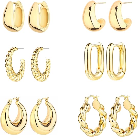
A few pieces that work on Bright Spring coloring. Your Style Hue earns a commission on qualifying purchases, at no extra cost to you.


Is this you?
Three checks you can do right now.
Stand near a window, no makeup if you can manage it. Two out of three is a strong signal.
01
Which gold?
Hold a high-shine gold piece to your jaw, then a brushed or antique one. Watch your skin, not the metal.
bright gold vs. antique goldBright Spring ifThe polished gold sharpens your features and the brushed one leaves your face slightly flat.
02
Clear or dusty?
Hold a watermelon pink top at your collarbone, then a dusty rose or mauve one in the same light.
Bright Spring ifThe clear pink brings your face forward and the dusty version makes your skin look tired and a little grey.
03
Black or cobalt at the neck?
Put on a black crewneck. Then swap it for cobalt, with bright ivory as the third option.
Bright Spring ifBlack is the first thing you see in the mirror, and cobalt or bright ivory lets your face lead instead.
If it’s close
The three you might be instead.
- Bright WinterThe usual mix-up. Same brightness, cool instead of warm — if silver beats gold and black at the neck looks right, it's this one.
- True SpringYou, warmer and one step less vivid. Golden honey and tomato red rather than citrus and watermelon.
- Light SpringYou, lighter. Peach cream and soft coral suit her; on you they go a little pale and polite.
The reading
Bright, and warm with it.
You’re the one who can wear cobalt at noon and somehow it works. You can put on citrus yellow without looking unwell. Strawberry-blonde, copper or warm dark hair with red lights; clear green, blue or blue-green eyes; warm-fair skin that freckles. Your features stay distinct instead of blending. And you’ve probably noticed that a whole outfit of “neutrals” leaves you looking oddly tired, as though the color drained out of your face.
Here’s the part nobody tells you: most warm-Spring advice online — terracotta, mustard, sage — is written for True Springs and Light Springs. Bright Spring is the clearest and most saturated of the three. Cobalt instead of navy, watermelon instead of dusty pink, leaf green instead of olive. Vivid, not earthy.
Your superpower is two bright colors at once. A watermelon-and-cobalt outfit would look like a costume on most people; on you it looks like a good holiday. Where other seasons hold themselves to one statement color, you can run two and keep the rest of the outfit clean. Think citrus orchards, watermelon at a summer party, a cornflower sky.
If you’ve always loved vivid color and been told to tone it down — welcome. You’ve been right. The rest is permission and refinement.
Same color, your version
Swap it, don’t skip it.
Almost nothing is off-limits. It's about which version of a color belongs to you.
- Instead ofBlack & optic whiteCobalt & bright ivoryYour dark and your light.
Black and chalk white are colorless — they give the eye nothing to answer your coloring with, so your face reads drained beside them. Cobalt holds the same weight as black and bright ivory does the same job as white, both with warmth and saturation in them.
- Instead ofSage & stoneLeaf & bright aquaGreen with the grey taken out.
Muted greens are made by adding grey to the hue, and that grey lands straight on your skin. Same colors at full clarity keep the freshness and drop the fog.
- Instead ofDusty rose & mauveWatermelon & tulip pinkPink at your volume.
This is the one that explains why the soft pinks in every store feel like nothing on you. Your features are already saturated; a pink that has been dialed down sits behind your face instead of lighting it.
- Instead ofNavy & rustRoyal & coralThe office pair, brightened.
Navy and rust are both darkened, earthy versions of colors you wear beautifully at full strength. Keep the hue, take out the mud, and the same outfit stops aging you.
The details
Denim, metals, prints.
Denim
 Crisp white
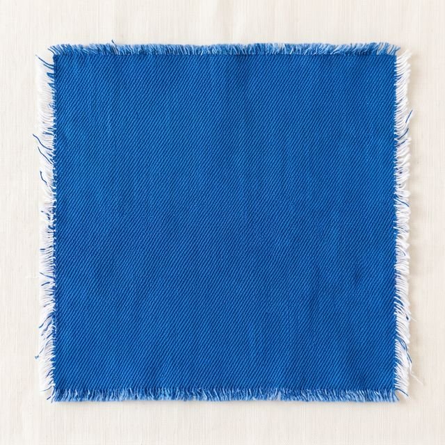 Bright indigo
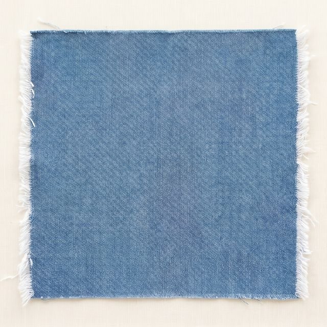 Mid cool
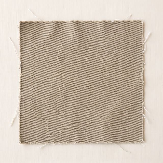 Vintage warm · not this
Crisp white, bright indigo, and a clean mid-cool blue. Vintage warm washes are the ones to leave — that soft sun-faded cast is exactly the mud your coloring has no use for. Your jeans should look recent.
Metals
- Bright gold
- Bright silver
- Polished brass
- Brushed
You get both, which is rare — yellow gold mirrors your warmth and high-polish silver matches your clarity. The deciding factor is shine, not hue. Brushed, hammered, matte and rose gold all read soft next to you.
Prints
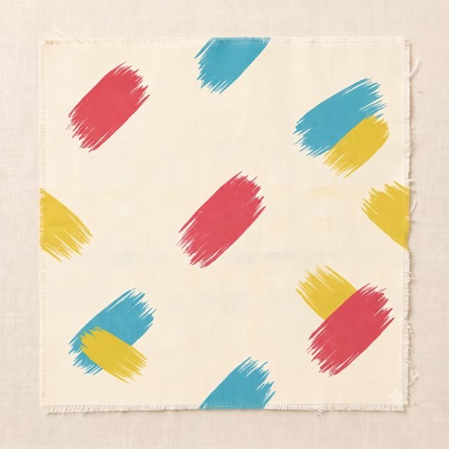 Brushstroke
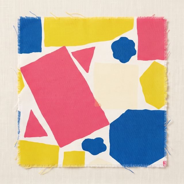 Color block
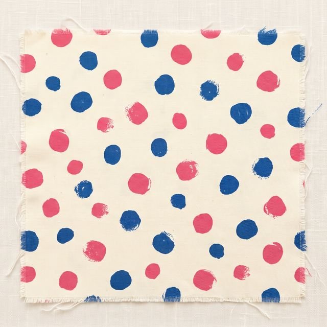 Dot
Dot
Bold florals in vivid color, clean stripes, color-block, anything Pucci-adjacent. Look for prints where each color stays itself instead of blending into its neighbour — muted watercolor florals, where the colors bleed and go dusty, are the ones to skip, along with grey-toned animal print.
Fabric
Crisp cotton, smooth silk, fine wool, clean linen — anything that holds its shape and holds its color. Your aesthetic is vintage Pucci meets clean Scandi: uncluttered cuts, saturated color. Washed-out, slubby and heavily textured fabrics go tired against your clarity.
Build the base
The staples worth owning.
Six pieces that make a Bright Spring wardrobe work. Get these in your colors and everything you already own starts coordinating with everything else.
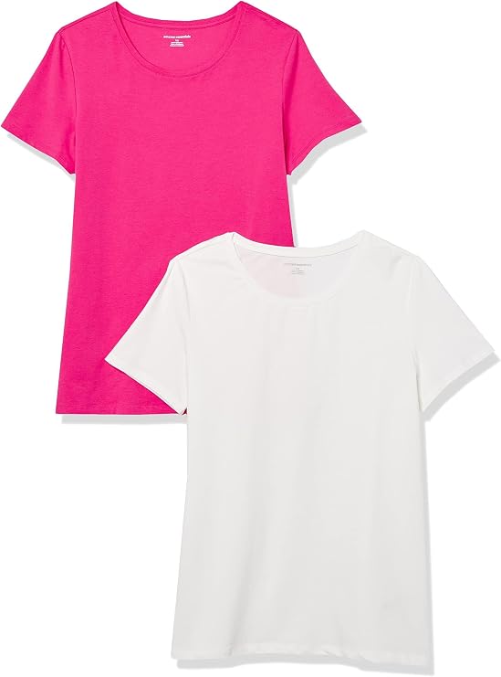
- Bright-ivory tee — not chalk white
- Cobalt pant or blazer
- Watermelon knit
- Coral dress
- Bright-aqua shirt or scarf
- Polished gold everyday jewelry
Where I’d start, if you’re filling gaps. Your Style Hue earns a commission on qualifying purchases, at no extra cost to you.


Reference points
Women who read this way.
Working hypotheses from photographs, not formal drapings — useful for training your eye.
Amy Adams
The case study. Coral, tulip pink, clear teal, citrus — she lifts. In dusty tones she looks slightly diminished.
Beyoncé
A reminder that Bright Spring spans skin depth. Vivid coral, citrus, clear emerald; muted tones do not do the same thing.
Princess Diana
The brightest-styled years. Sailor stripes, cornflower suits, coral and watermelon party dresses.
Florence Pugh
Poppy red, bright pink, vivid green. Put her in muted earth tones and the photograph goes quiet.
Olivia Newton-John
Warm honey blonde, blue-green eyes, warm-fair skin. The bright jumpsuit era is a Bright Spring uniform.
The common thread is clarity worn with confidence. Once you see the Bright Spring effect, you’ll spot it on every “she just looks happy in what she wears” woman you can name.
Still deciding
Common questions.
- Is Bright Spring the same as Clear Spring?
- Yes. Clear Spring and Bright Spring are two names for the same season, from two ways of naming the twelve. One names a season by where it sits in the system, the other by what the coloring looks like. Your Style Hue uses Bright Spring throughout. If you were told you are a Clear Spring, this is your page and this is your palette.
- Bright Spring or Bright Winter?
- The most confused pair here. Both are bright, both wear vivid jewel tones. The difference is undertone: Bright Spring tilts warm, Bright Winter is cool. Quick test — hold pure yellow gold to your face, then bright silver. If gold makes you glow, you are Bright Spring. If silver sharpens you and black at the neckline looks right, Bright Winter.
- Bright Spring or True Spring?
- Both are warm Springs. True Spring is a little warmer and a little less vivid; Bright Spring is closer to neutral-warm and noticeably more saturated. A True Spring at her best is in golden honey, leaf green, tomato red. You are at your best in cobalt, watermelon and citrus — same family, brighter dial.
- Can I wear black?
- In small doses, away from your face — black pants under a coral top is fine. Head-to-toe black drains you, and black at the neckline tends to read tired. If a dress code demands it, use warm charcoal instead and put color at your collar: a vivid scarf, bright lipstick, statement earrings.
- What about pastels?
- Most of what retailers sell as pastel is too dusty for you — powder pink, baby blue, lavender all go flat. The bright pastels work: clear peach, tulip pink, fresh aqua. The rule is simple. If a pastel still looks clear and saturated, it is yours. If it looks like it has been left in the sun, walk away.
- Best lipstick shade?
- Clear coral, watermelon, true poppy red, vivid tulip pink. Look for "true red," "coral," "poppy," "bright pink." Muted nudes wash you out and deep wines sit too heavy. NARS Heat Wave, MAC Lady Danger and Charlotte Tilbury Hot Lips are the right family.
- My hair is dark now, but I am fair. Am I still Bright Spring?
- Possibly. Natural pigment deepens with age, and plenty of Bright Springs are darker at forty than at four. Your season comes from your skin and eyes more than your hair. If your skin is warm-fair, your eyes are clear and vivid, and your natural color under any dye has warmth and saturation in it, you are likely still here. The face at the neckline will tell you.
- Why do minimalist palettes feel boring on me?
- Because your coloring wants color. The cream-stone-oatmeal-soft-black palette is lovely on a Soft Summer and slightly lifeless on you. The version of minimalism that works for you is uncluttered, well-cut pieces in your bright palette — minimalist structure, not minimalist color.
From the Journal
Reading on the method.
If this season feels close but not quite yours, the journal goes deeper on how the 12-Season system works and how to confirm your reading.
Why your season has three different names
Cool Summer, Dark Winter, Muted Autumn — the alternate names for the twelve, and why "cool" alone never identifies a season.
Read the note →
Personal color analysis, explained
A primer on what color analysis is, where it comes from, and what changes when you use it.
Read the note →
Find your season at home
A 20-minute step-by-step that gets you to your season with a stack of fabric and a mirror.
Read the note →
Warm or cool undertone? Five at-home tests
Triangulate across five tests to find your undertone — wrist, white-vs-cream, gold-vs-silver, sun reaction, foundation history.
Read the note →
The twelve seasons, read closely
A walking tour of all twelve seasons — what each one means and the mood behind each palette.
Read the note →
Shop this season
Everything picked for Bright Spring.
13 shopping guides answer Bright Spring, from the coat to the red lipstick, each in the Bright Spring color. There's a whole Bright Spring fall capsule too.
Not sure this is your season?
Find out in a minute, then get the letters for yours.
The analysis reads your own photograph and names one of the twelve — it takes about a minute and nothing leaves your device. Leave your address and you'll get one short letter every few weeks: what to wear at your face, and what to pair it with.
Issue 02 · September 2026Fall only sells you two redsRead it first
Not sure this is you?
Find your season in a minute.
Upload a portrait and the analysis runs entirely in your browser. Your photo never leaves your device — there’s no server to send it to.
Find my colorsBright Spring is one of twelve. If your coloring sits on a border — and plenty do — the analysis measures undertone, depth and how clear or muted you are rather than guessing from a description.