The Journal · Method
Find your season
at home.
By the Your Style Hue editors · Published May 19, 2026 · 12 min read
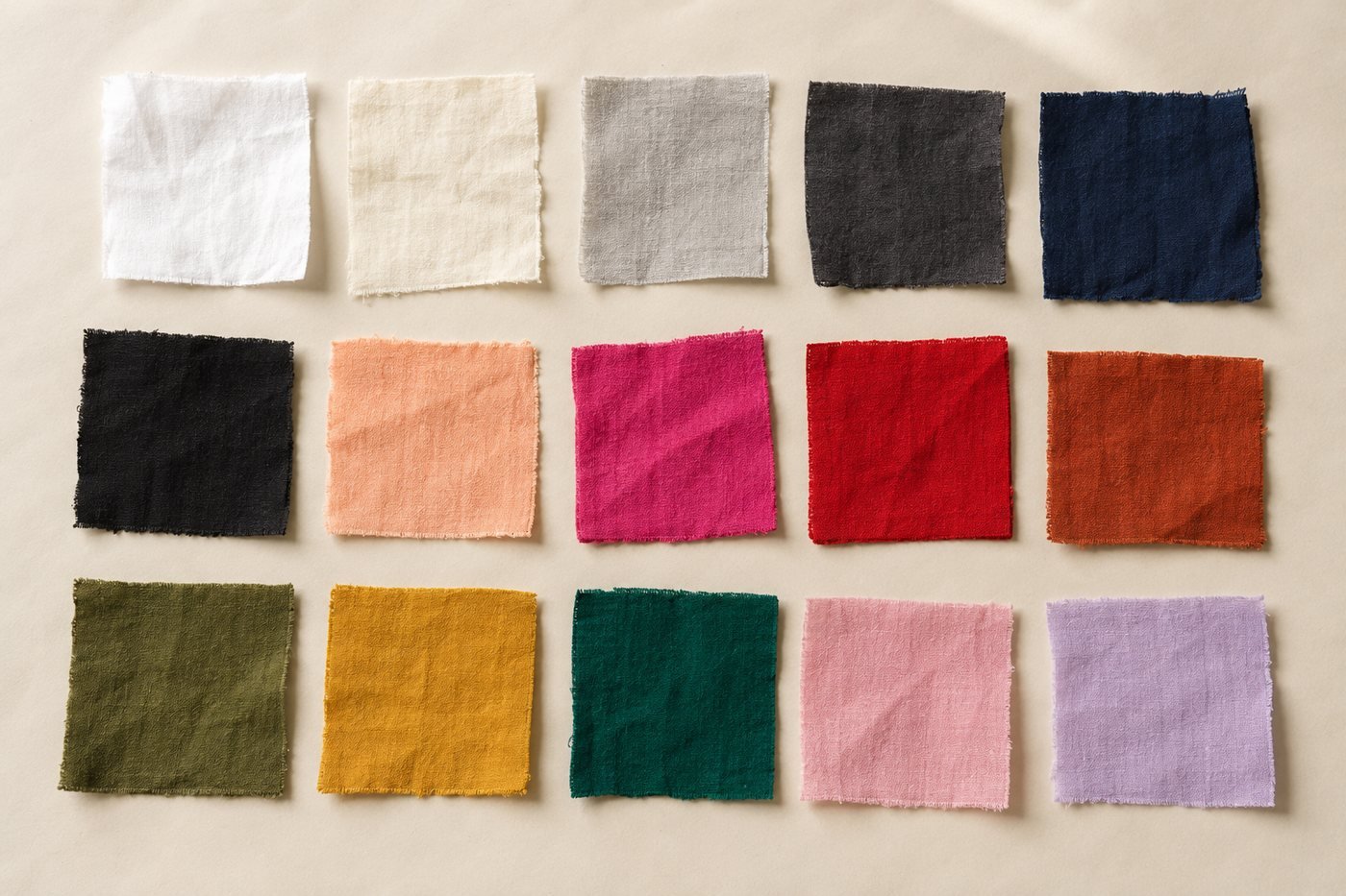
Most personal color guides assume you have access to a professional draping — three hundred dollars, a couple of hours, a stylist with ninety swatches of silk. The result is excellent, but it is also a significant commitment for what is essentially a yes-or-no assessment of which colors work on you.
Below is the same method, translated for home. You can do it in your own bathroom mirror in about twenty minutes. It will not be as precise as a trained consultant — fifteen years of looking at skin against fabric does refine the eye — but it will get you ninety percent of the way there, and that is enough to dress yourself well.
The 12-Season system reduces to three readings. Get those three right and you land in exactly one of twelve palettes.
What you will need
- — A bright window with north-facing daylight, or any window with indirect sun.
- — A makeup-free face. Wash it off. The whole point is to see your skin.
- — Hair pulled back, or covered with a neutral towel. Dyed hair throws the eye, and even natural hair can dominate the reading if you let it.
- — A mirror. Big enough that you can see your full face.
- — Several large pieces of fabric in a range of colors. T-shirts from your closet work; so do scarves, sheets, or actual fabric swatches if you have them. The list of colors is below.
- — Twenty to thirty quiet minutes.
The fabrics you want, at minimum: pure white, cream, dove grey, charcoal, navy, black, peach or coral, fuchsia or hot pink, true red, rust, olive, mustard, emerald, pastel pink, soft lavender. Fifteen colors. They do not have to be exact — the goal is to cover the warm-cool, light-deep, and clear-muted axes.
- Pure white
- Cream
- Dove grey
- Charcoal
- Navy
- Black
- Peach
- Fuchsia
- True red
- Rust
- Olive
- Mustard
- Emerald
- Pastel pink
- Soft lavender
The three readings
The 12-Season system measures three things:
- Undertone — warm, cool, or neutral. The hue underneath your skin.
- Depth — light, medium, or deep. How much pigment your hair, eyes, and skin carry collectively.
- Chroma — clear or muted. Whether your coloring reads saturated and crisp, or softened and dusty.
Each reading takes a few minutes. Combined, they place you in exactly one of twelve seasons. Take them in order — earlier readings inform later ones.
Reading 1: Undertone
We covered undertone in detail in its own article. The short version, for this exercise:
- — Look at the inside of your wrist in natural daylight. Green-leaning veins suggest warm; blue or purple veins suggest cool; both is neutral.
- — Hold a pure white shirt next to your bare face, then a cream one. White flatters cool undertones; cream flatters warm; both fine equals neutral.
- — Silver versus gold jewelry, held one to each side of your face. The one that disappears into your skin in a good way is yours.
Pure white
If this one makes your skin look clearer and your eyes brighter, you lean cool.
Cream
If this one makes you look rested and the white looked stark, you lean warm.
Silver
Sits quietly on cool skin and mirrors it back.
Gold
Lights up warm skin; on cool skin it sits on top rather than blending.
Write down your reading: warm, cool, or neutral. If you are not sure between two of them, note which way you lean. That lean matters for the next steps.
Reading 2: Depth
Depth is the overall density of pigment across your features. It is not just hair color or skin shade — it is all three (hair, eyes, skin) taken together. A pale-skinned woman with very dark hair and dark eyes is "deep" overall; a strawberry-blonde with green eyes and porcelain skin is "light." This is the easiest of the three readings to take — it answers a simple question: how saturated is the picture?
Three quick tests:
The hair-against-white test
Hold a pure white piece of fabric just below your hairline in front of the mirror. Does your hair contrast sharply against the white (deep), or does it look only a few shades darker (light)? Medium is anywhere in between.
The eye-contrast test
Look at your eyes from a few feet away. Can you tell where the iris ends and the pupil begins, or do they blur together? Strong contrast within the eye is a lighter overall depth; blended-together eye color is deeper.
The black-and-white photo test
Take a photo of yourself in natural light, then convert it to black and white on your phone. Look at the photo from across the room. Is it a mostly-light photo with a few darker accents (light), a mostly-dark photo with a few lighter accents (deep), or a balanced mid-range image (medium)? This single test is probably the most reliable depth read.
Write down your depth reading: light, medium, or deep.
Reading 3: Chroma
This is the trickiest of the three. Chroma is about whether your coloring reads as clear — crisp, saturated, jewel-bright — or muted — soft, dusty, painterly. It is also called "value contrast" in some color systems.
Two ways to test it:
The bright vs muted test
Hold a saturated jewel tone (true emerald, electric blue, hot fuchsia) up to one side of your face. Then hold a softened, dusty version of the same color (sage, slate blue, dusty rose) up to the other. Which side looks "put together" — and which looks slightly mismatched? Bright tones harmonize with clear coloring; muted tones harmonize with muted.
Clear
Saturated and crisp, as though lit from inside. Clear coloring can hold this without being overtaken by it.
Muted
The same blue with grey mixed in. Muted coloring settles against this; clear coloring goes flat next to it.
The features-blend test
Look at your features in the mirror from about three feet away. Do individual features stand out — eyes pop, lips have distinct color, features feel "drawn in"? That is clear coloring. Or do your features blend harmoniously into one another, with no single feature jumping out? That is muted coloring.
People with clear coloring often look best in high-contrast outfits (a saturated color with crisp white, or black). People with muted coloring look best in tonal outfits (soft on soft, with no single color dominating).
Write down your chroma reading: clear or muted.
Putting the three together
You now have three readings. Here is how they combine into your season — find the row that matches what you wrote down:
SpringWarm · clear
SummerCool · soft
AutumnWarm · muted
WinterCool · clear
The fabric is the prompt; your face is the answer.
The home draping technique
What an in-person consultant does is hold large pieces of colored fabric up to your face and watch what happens. You can do the same thing yourself — it will not be quite as precise, but it is the same fundamental method.
The technique, in five steps:
- Set up. Wash off makeup. Pull hair back. Sit in front of the window with the mirror in front of you. Have your fifteen color swatches within arm's reach.
- Drape one color at a time. Hold each fabric directly under your chin, draped against your collarbone so it fills the area around your face. Look at your face — not the fabric.
- Ask three questions for each color. Does my face look fresher or more tired? Do my under-eyes look better or worse? Does my skin look healthier or sicker? Trust your first impression. Do not overthink.
- Sort into three piles. "Yes — this makes me look great." "No — this makes me look washed out, sallow, or tired." "Neutral — fine but nothing special."
- Look at the patterns in your yes pile. Are most of them warm-toned or cool? Light or deep? Saturated or muted? The pattern in the colors that work on you is exactly the season you are.
Common mistakes
- Warm-bulb lighting. Tungsten and "warm white" LED bulbs shift everything yellow. Even one window is better than the whitest bathroom vanity light. North-facing daylight is best.
- Hair distracting the eye. Dyed hair convinces you that you are warmer or cooler than you actually are. Cover it with a neutral towel before draping.
- Looking at the fabric instead of your face. The fabric is the prompt; your face is the answer. People naturally look at the colored fabric and decide whether they "like" it — but the question is whether it makes you look better, which is a different question.
- Skipping a reading. Some people decide their undertone, skip depth and chroma, and call themselves a Spring or Autumn. But undertone is only one of three axes — a warm undertone can be light or deep, clear or muted, which changes the season entirely.
- Forcing a "clean" answer. If three colors are saying warm and two are saying cool, you are not broken. You are a neutral-warm, and you will likely land in Soft Autumn or Soft Summer.
Or, take the shortcut
If twenty minutes of careful draping is more than you want to commit, the Your Style Hue reading does all three measurements automatically. It samples the skin tones in three regions of your face, your hair color, and your eye color from a portrait, and runs the same three-axis classification a trained consultant runs by eye.
The reading takes about a minute. It happens entirely inside your browser — your photograph never leaves your device. It is free.
Frequently asked
How long does the home reading take?
Plan on about twenty minutes if you have your fabrics ready. Most of that time is spent quietly looking — there is no rush. If you try to hurry, you will misread your skin, so settle in.
What if my fabric swatches are not perfect color matches?
They do not have to be. T-shirts, scarves, or sheets pulled from your own closet work fine, as long as you cover a range — pure white, cream, dove grey, navy, black, peach, fuchsia, true red, rust, olive, mustard, emerald, pastel pink. The point is to test how each general color family interacts with your face, not to test a specific shade.
What if I land between two seasons?
That is information, not failure. Adjacent seasons share two of three readings — so if you are landing between Soft Summer and Soft Autumn, both are "soft" (muted) and your undertone is sitting near neutral. You will look good in both palettes, with the truer one giving you a slight edge. Pick the one that gets the most "yes" responses in your draping and start there.
Should I try this in summer or winter?
Try it in the season when your skin is closest to baseline — typically late winter or early spring, before any tan. A fresh tan will throw your undertone reading toward warm and your depth reading toward deeper. Repeat the reading in a different season to confirm.
Can someone else do this reading for me?
Yes, and it helps. A second pair of eyes catches things you cannot see in your own face. Have a friend or family member sit a few feet away while you hold each color up. They will notice when a color is making you look healthy, tired, or washed out faster than you will.
Take The Reading
All three readings,
in about a minute.
Undertone, depth, and chroma — measured from a portrait in your browser, matched to one of twelve specific palettes. Your photograph never leaves this device.
Find my colors